Consumer technology is, usually, profoundly dull. I love technology, but even I must concede the undeniable. A new pair of light gray, plastic cupped, noise-canceling headphones are functional, and often great, but they hardly get the blood rushing. Yet another gray Windows notebook has released! I struggle to stifle a yawn. And then — worst of all — are the phones.
In the sixteen years since the first iPhone debuted, smartphones have become ubiquitous; the market is so large and flooded that innovation is no longer worth the risk. Phones are not cool new devices, but tools. You don’t care how a hammer looks; you care about the price and if it can hit a nail. The latest iPhone is a tool for accessing the internet and taking selfies. Most Android phones are the same but cheaper.
There’s little excitement in consumer technology. But not nothing. Or, shall I say, Nothing.
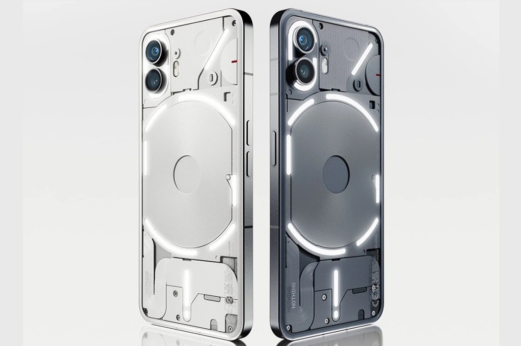
Founded by OnePlus co-founder, Carl Pei, Nothing is an under three-year-old, London-based tech company that makes high-value-for-money products — like its newly announced Phone (2) — offering most flagship features for prices significantly below that. It has the high-end Snapdragon 8 + Gen 1 chip, a large 4700mAh battery, beautiful 6.7” 1600-nit OLED screen, but starts at only $599. That’s great value; but you can find similar specs for similar prices with Samsung and Xiaomi phones. The difference is that Nothing makes its products feel special, premium and unique; and it achieves this through high-end, clever design. You can tell Nothing has taken on many employees from Dyson. Its approach feels like the Apple of old; and it uses the same design trick: transparency.
Having been kicked out of his own company, Steve Jobs returned to a flailing Apple in 1996 and wanted to release a product that would show precisely how good he was. In a packed field of beige boxes, he wanted to make a computer that wasn’t just technically impressive, but a beautiful object; something you actively wanted to have in your home. And so, his design team — led by Jony Ive — clad the teardrop-esque computer in a translucent, colorful back, teasing the electronics within. It’s a classic piece of consumer design that still looks fantastic today; and beyond the proportions and perfect colors, it’s the transparency that makes it.
Why is that? Well, as boys we always loved tearing things apart to see how they worked, and seeing the inside of complex systems brings us back to that joyful curiosity. It combines the feeling of solving a puzzle, with discovering a new world through a back of a wardrobe, and it’s why, in a digital age, we still buy mechanical watches. Be it on a watch case back or a computer chassis, there’s no function to transparency, but it makes you appreciate the attention behind and complexity of a product’s construction. And it’s fun.
Almost twenty-five years later, and Nothing — hoping to jumpstart its interlocking product ecosystem, like Apple — has applied the same tricks as the iMac, elevating staid product sectors through careful design.
Tear apart an AirPod, and you’re met with a mess of crammed cables and glue globs. But Nothing’s slim, light Ear (2) earbuds have a transparent stem, revealing their tiny circuit boards and buttons. Flickering on the Phone (2) is no different from any premium smartphone; but sitting it face down reveals an intricate array of textured panels and a large central wireless charging coil, right beneath its slightly curved glass back. Its details and endlessly interesting, but Nothing incentives you to look at it by adding a series of white LED light strips alongside those panels. This is their “Glyph Interface,” allowing users to read information off the back of the phone, screen face down. These lights can tell you of important notifications, volume adjustments, what’s left on a timer, how the phone has charged and even how far away your Uber is.
That’s handy and has a solid philosophy behind it — of using a device intentionally, without the distractions of endless feeds — but that’s not what is best about it.
As I sit at my desk, using the Glyph Interface as a timer for my writing, glancing at the detailed back of the phone, it made me smile. And it’s not often a new, gray phone can do that.


