Quizzed on how best to assimilate a new culture, travel writer and celebrity chef Anthony Bourdain once uttered the famous line: “Drink heavily with locals whenever possible.” I never met the man, but still I miss him and his deft writing. The Opening a Bottle series is about getting pickled with people far cooler than I am, in whatever city I’ve washed up in.
An old bank, complete with deep underground vaults, is an objectively cool place to build a hotel. I remember the buzz around the Ned’s ambitious opening in London in 2017, hiding a clandestine cocktail bar within the original Midland Bank strongroom. Memories of that two-meter-wide door flood back, as Hotel Per La’s staff show me to the restroom — past a huge vault wheel and rows of long-sealed safety deposit boxes.
I’m in downtown LA just as the Hollywood sign turns 100, speaking to the rock star hotelier who envisioned this achingly cool space (and had a hand in The Ned, so it happens).
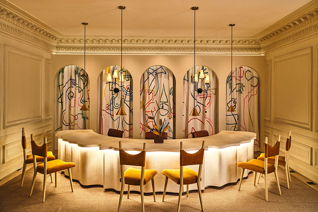
A new entrance on Olive Street leads visitors inside Hotel Per La’s world of old-school Italian glamour and new Los Angeles-school chic; a vibrant mix of bold color, amorphic lighting, eclectic patterns and custom fixtures. Check-in could be an opening scene from the Barbie movie, framed by floor-to-ceiling curtains dotted with a fun, wavy pattern.
Longtime hotelier Jeremy Selman (NoMad, Freehand, LINE) made a lot of these outlandish, exquisite design choices. Up at poolside Bar Clara, I order a Bees: Ford’s gin, honey, habanero tincture, mint and lemon. Then I ask the man behind the (groovy) curtain to tell me more.
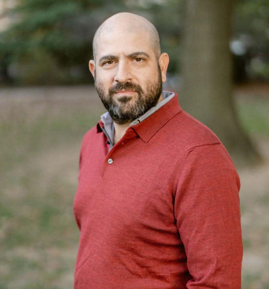
“All of the elements of the design are bespoke to the building and inspired by the building’s history and location,” Jeremy begins.
Instagram brought me here; months back, I’d idly saved a video of a giant gargoyle-shaped rooftop fireplace, sparks flying from its cavernous mouth. Downstairs, a mirrored hallway gives way to what was once the Bank of Italy’s lobby, where towering plant fronds almost touch the fabulously high ceilings.
“I love how the old-world glitz is shot through with more playful touches,” I note.
“It’s a subtle blend of modernity and classicism. This can be most felt in elements such as the bar, where a traditional use of plaster has been reimagined in a modern artist-commissioned wall-covering on the dye wall,” Jeremy explains.
I discover that it was not, in fact, a man behind the curtains, but a woman:
“Likewise, our check-in desk combines a modern ‘wavy’ shape. It’s a key design element implemented by lead designer, Jaqui Seerman — all housed within a traditional paneled room.”
I ask him how the initial work began, wondering if he had an aesthetic in mind from the get-go.
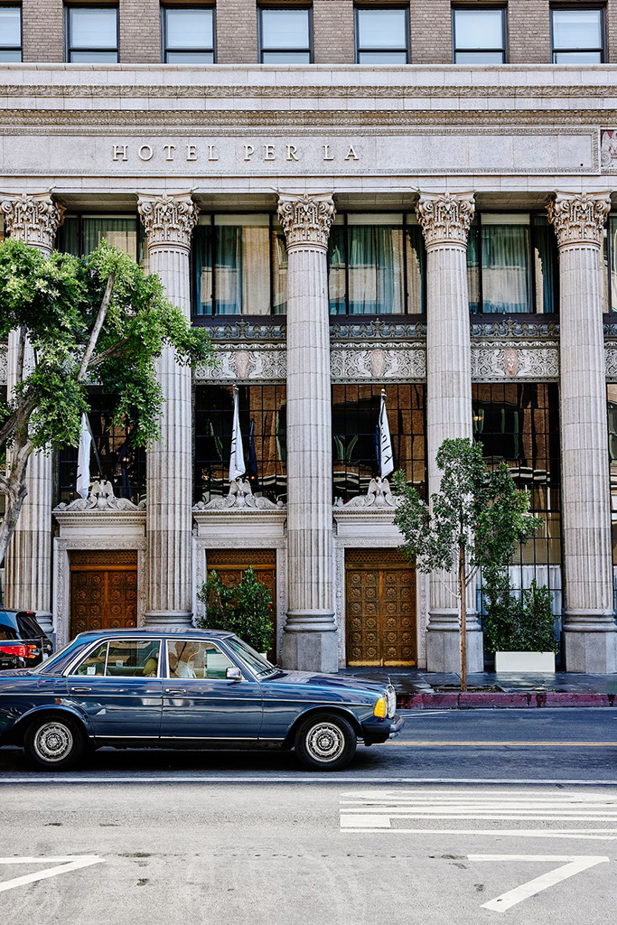
“The building was originally commissioned by Amadeo Giannini as the Los Angeles headquarters for Bank of Italy — the predecessor to Bank of America.
“Giannini was an Italian immigrant. We took Giannini’s lead by embellishing the hotel’s Italianate design with odes to Los Angeles. That influence can be felt throughout the building… from the Venetian-inspired ceilings in the restaurant to the Neoclassical colonnade along 7th Street.
“It’s most felt in the art program found throughout the hotel’s guestrooms and public spaces.”
Indeed, the roomy Claire Suite I’m ecstatic to be sleeping in is scattered with photographs, capturing romantic scenes from Italy and Los Angeles.
“What are you trying to get across?” I ask.
“We really wanted to balance the grandeur of the historic banking hall with a more intimate residential design felt throughout the guestrooms and check-in experience,” Jeremy continues.
“The gentle falling water from the fountain in the reception is intended to help guests entering the building decompress from the world outside and put them in a headspace to experience the richness of the design and experience within our walls.”
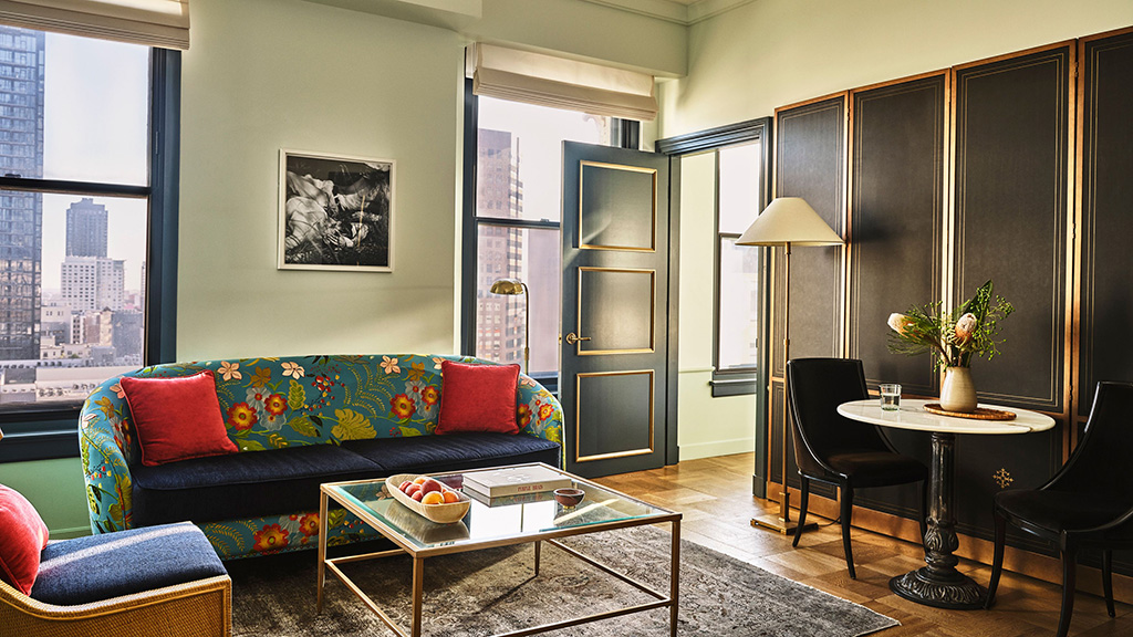
Jeremy calls it “California ease with a European attention to detail.” There’s art everywhere you look, and it’s a lot to take in. I wonder if my untrained eyes have missed anything important.
“The approach to the building was to consider every element of the guest experience and promote a sense of ongoing discovery. The art program is a great example of this. With more than 4,000 unique pieces of art throughout the building, no two rooms are the same. This approach allows guests the opportunity to continue their discovery with each visit.”
“How do you design a great hotel? What’s most important to you, during the process?”
“Everything comes down to emotion. This comes from considering the details. Hotels are living spaces, so the guest experience and the design need to dovetail in order to create an exponentially richer experience.”

Later, I cap off the evening with a sensational meal at Per L’Ora, the Italian restaurant downstairs. Focaccia with garlic confit, meatballs and my new favorite dish of all time, sweetcorn agnolotti. Guests sip espresso martinis from high emerald chairs at the opulent bar next to us. Basking in this space that combines un po’ di tutto so beautifully, I can attest: this is one of my life’s richer moments. Missione compiuta.


